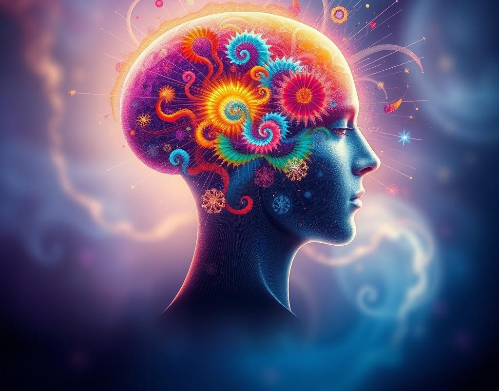
Color psychology plays a powerful role in the world of visual communication, especially in graphic design. Every shade, hue, and tone sends a message to the human brain, triggering emotions, influencing decisions, and shaping perceptions. When designers understand how colors speak, they can create designs that not only look beautiful but also connect deeply with the audience. This is why successful brands and designers use colors strategically rather than randomly. The way colors influence human behavior is subtle yet impactful, and mastering this skill can transform ordinary designs into meaningful experiences.
Color has the ability to make a message stronger, more memorable, and emotionally charged. A single color can communicate trust, excitement, warmth, or danger without using a single word. Think of the bold red of a fast-food logo, the calming blue of a tech brand, or the elegant black of a luxury product. These choices are not accidental. Designers and marketers study how audiences react to colors to build powerful visual identities. Colors set the mood, guide attention, and help create emotional connections between brands and their customers.
Red is one of the most emotionally intense colors. It symbolizes passion, energy, urgency, and power. It’s often used in call-to-action buttons, sale banners, and warning signs because it immediately captures attention. In branding, red can create excitement and urgency, which is why many food chains and entertainment brands use it to encourage quick decisions and emotional responses. However, red can also represent danger or aggression if overused, so balance is key.
Blue, on the other hand, represents trust, stability, calmness, and reliability. It’s often seen in corporate, healthcare, and technology branding. Blue makes people feel safe and secure, which is why many financial institutions and software companies prefer it. Unlike red, blue does not create urgency; instead, it builds confidence and peace of mind. This makes it an excellent choice for brands that want to establish long-term trust and loyalty.
Yellow is bright, cheerful, and energetic. It represents happiness, optimism, and creativity. This color is eye-catching and works well in designs that want to spread positivity and warmth. However, yellow can also be overwhelming if used too much. It’s best used as an accent color to draw attention to key elements, like buttons, icons, or highlights. Yellow stimulates the brain and creates feelings of energy, which is why it’s often used in educational and creative industries.
Green symbolizes nature, balance, growth, and health. It has a calming and refreshing effect, making it ideal for eco-friendly brands, health products, and wellness campaigns. Green is associated with harmony and is often used to communicate freshness and natural elements. It can also represent success and wealth when used in darker tones. This color works well for brands that want to promote stability, peace, or environmental values.
Black is bold, elegant, and sophisticated. It creates a sense of power and luxury. High-end brands often use black to give their products a sleek and premium feel. Black can make other colors stand out and works beautifully in minimalist design. However, if not used carefully, black can also feel cold or unapproachable. That’s why designers often balance it with lighter tones to maintain visual harmony.
White represents simplicity, cleanliness, and purity. It’s commonly used as background color because it gives space to breathe and highlights the main elements of the design. White evokes a feeling of openness and is frequently used in modern, minimalist, and healthcare-related designs. When paired with other colors, it enhances contrast and gives the entire composition a clean, professional look.
Purple combines the calmness of blue and the energy of red, representing creativity, luxury, and spirituality. Historically associated with royalty and power, purple is often used by brands that want to appear unique, artistic, or imaginative. Lighter shades of purple are more soothing and feminine, while darker shades can add a sense of mystery and sophistication. It’s a versatile color for designs that want to stand out while maintaining elegance.
Orange blends the warmth of red and the brightness of yellow. It’s playful, energetic, and inviting. Orange encourages enthusiasm and action, making it great for brands targeting younger audiences or promoting fun, active lifestyles. It is often used in call-to-action elements, social media campaigns, or advertisements that need to grab attention quickly. Orange is friendly and energetic, but too much can feel overwhelming, so balance matters.
Pink symbolizes warmth, kindness, and emotion. It’s often associated with femininity and softness, but in modern design, it’s also used to show creativity and innovation. From soft pastels to vibrant hot pink, this color has a wide range of applications. It’s popular in beauty, fashion, and lifestyle industries, creating a sense of approachability and care.
Brown gives a natural, earthy, and grounded feeling. It represents reliability, comfort, and authenticity. It’s widely used in food, organic, and rustic designs. Brown creates a sense of stability and trust, often paired with green or beige for a natural look. Though not as attention-grabbing as red or yellow, its subtle warmth gives designs a strong foundation.
Every color also has cultural meanings. The same color can evoke different emotions in different countries or communities. For example, while white symbolizes purity in many Western cultures, it is associated with mourning in some Asian cultures. Designers working on global projects must understand these cultural differences to avoid sending the wrong message. A color that inspires trust in one culture might carry negative connotations in another. This is why research and understanding the target audience are critical in professional graphic design.
Color also works hand in hand with typography, layout, and imagery. The impact of a design is not just about one color but how multiple colors work together in harmony. This is known as color harmony. Designers use color wheels to create combinations that feel balanced and visually appealing. Complementary colors, analogous colors, and triadic color schemes are common methods to create harmonious palettes. For example, combining blue and orange can create a vibrant, balanced design, while combining shades of green and yellow can make the design feel fresh and natural.
Contrast is another crucial element of color psychology in design. High contrast helps guide the viewer’s eyes to important elements, like buttons, headlines, or key messages. A designer might use a bright yellow call-to-action button on a dark background to make it instantly noticeable. On the other hand, low contrast can create a softer and more elegant look, suitable for luxury brands or editorial layouts.
Color also affects readability. A text written in light colors on a light background can be hard to read, while a dark text on a light background increases clarity. Professional designers pay close attention to color contrast to make sure the design is not just beautiful but also accessible to everyone. Accessibility matters, and thoughtful color use can make a big difference for people with visual impairments.
Colors can also set the tone for different industries. In the tech industry, blue dominates because it communicates trust and professionalism. In the food industry, warm colors like red, orange, and yellow are popular because they stimulate appetite. In the fashion and luxury sectors, black, white, and gold often give an exclusive, premium feel. In the health and wellness industry, greens and blues bring a sense of calmness and balance. Understanding these trends allows designers to align their work with the expectations of the audience while adding their creative touch.
Psychological effects of color go beyond aesthetics—they influence decision-making. Studies show that people often decide within seconds whether they like or trust a product based on its color alone. This is why well-known brands spend time and resources developing strong color identities. A signature color can make a brand instantly recognizable even without a logo. For example, the red of Coca-Cola, the yellow arches of McDonald's, or the blue of Facebook are iconic and deeply associated with their identities.
For designers, understanding color psychology means going beyond what “looks good” and focusing on what “feels right.” Choosing colors intentionally allows them to create emotional impact, influence perception, and communicate messages effectively. When colors align with brand personality and audience emotion, they create a powerful visual connection.
Even in personal portfolios and freelance work, the way colors are used can make a lasting impression. A carefully chosen palette can communicate professionalism, creativity, or friendliness before a client even reads a word. Color tells a story on its own, and skilled designers know how to make it speak clearly and powerfully.
In the end, color psychology is not just a design trend—it’s a fundamental communication tool. It allows designers to speak a universal visual language that connects with people’s emotions and subconscious. Mastering this language gives a designer the power to create designs that are not only visually appealing but also emotionally memorable. In a world where first impressions are made in seconds, understanding how color speaks can set a designer apart from the crowd and turn simple visuals into meaningful, impactful designs.
Welcome to ApnaBrand a digital space built for thinkers, learners, and dreamers who believe that knowledge has no limits. Here, curiosity meets creativity, and every idea has the power to inspire growth.
